This webpage describes the basic guidelines we can follow to ensure consistency for the Nashville Classical Charter School brand in the real world—both online and offline. All of the necessary files for digital and print applications are labeled and linked for download right from this webpage.
Your logo is the mark that represents your business on all client-facing materials.
We want Nashville Classical Charter School to come to mind when young families think about the best education & future for their children. We want donors to recall fond memories of touring your campus during your annual giving drive. A consistent presentation of your brand is crucial to maintain this awareness. The logo acts as the heart of your brand—a visually strong mark that represents the core of NCCS’s values and culture.
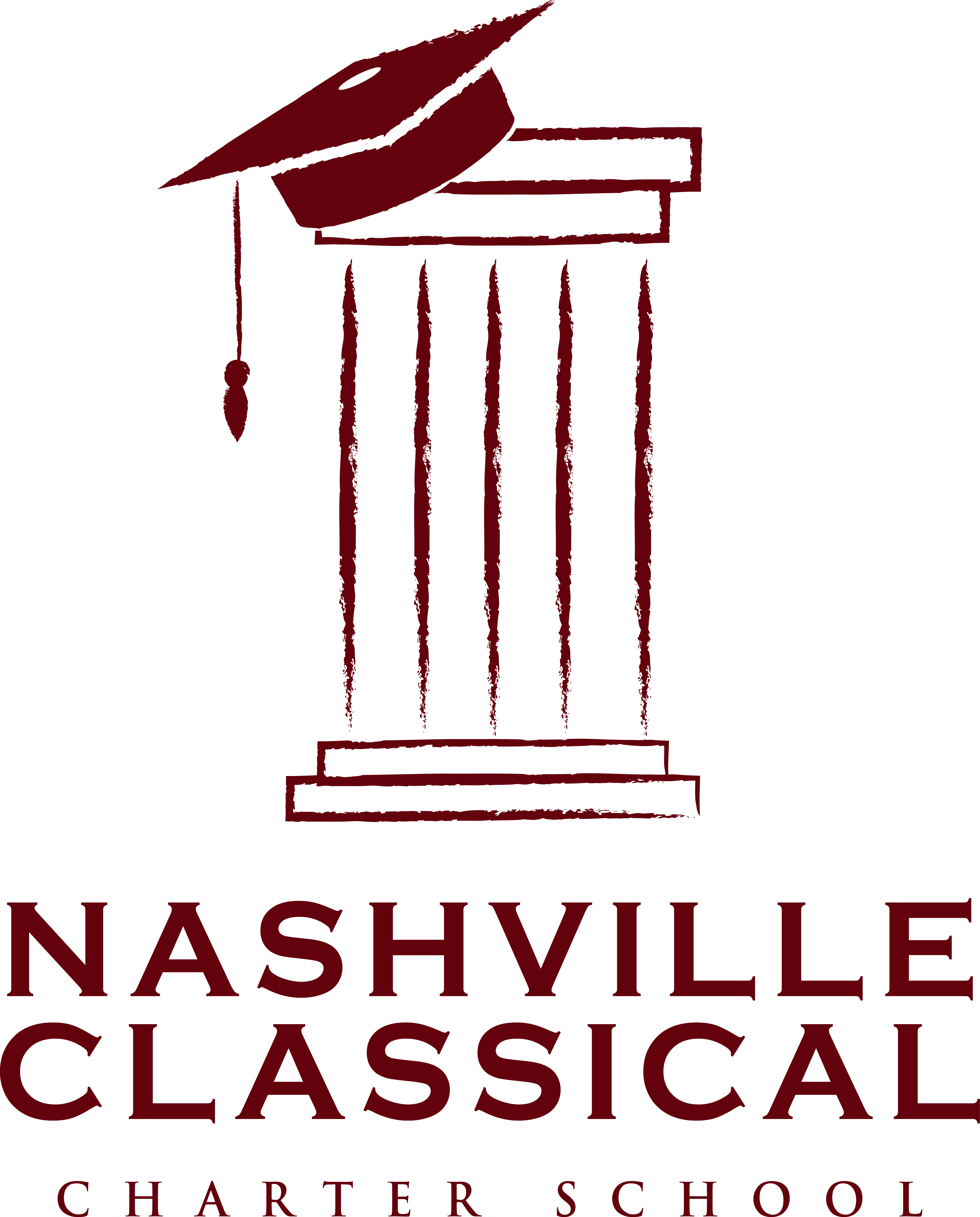
The full logo has three main parts:
We refer to this as the Cap & Column; a chalk-drawing representation of a classic Doric Column, crowned with a graduation cap. The Column embodies the roots NCCS has in a classical education, while the cap reminds students, parents, and the greater community of their collective goal: prepare these underserved kids from day one to excel in and graduate from college. The chalk styling reinforces a child-like approach to the world.
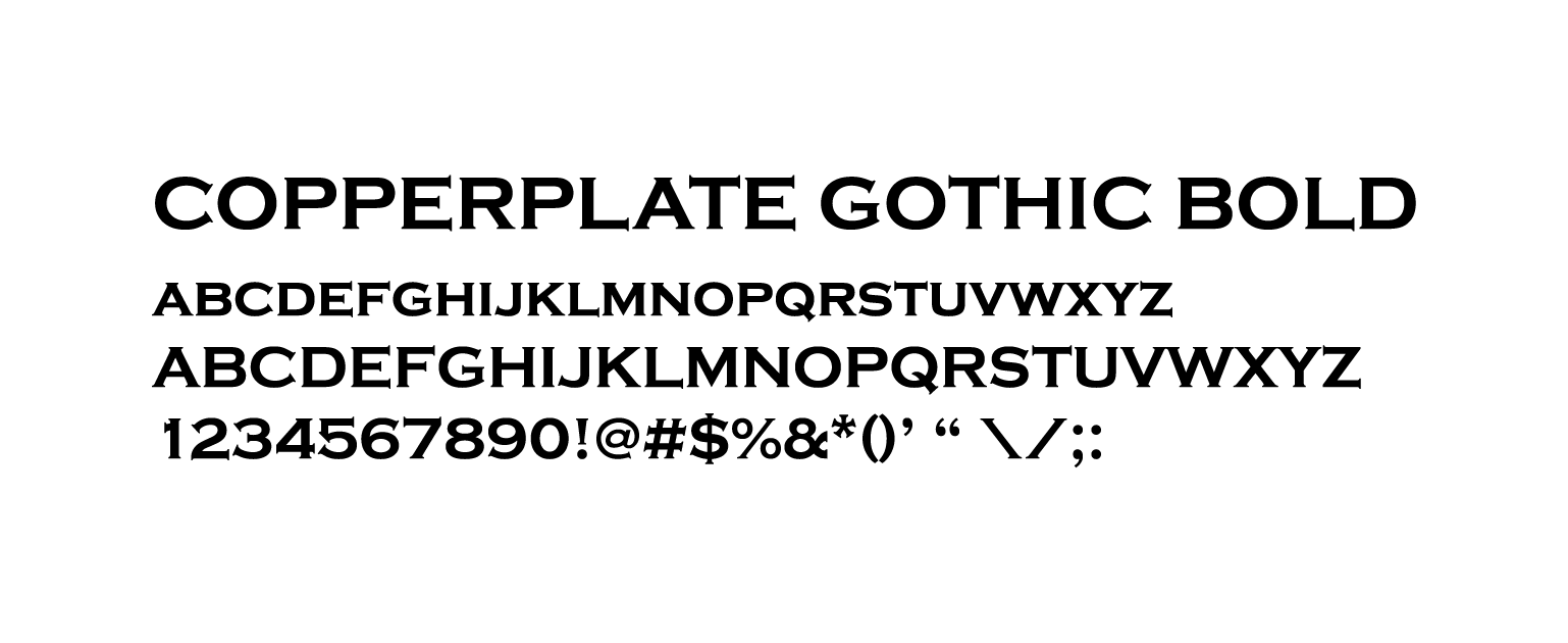
Nashville Classical, styled in All-Caps Copperplate Gothic Bold.
Charter School, styled in All-Caps Trajan Pro Bold.
The logo allows for multiple arrangements. Note the proper arrangement and proportions of each configuration—kindly allow for breathing room and refrain from deviation.
Full Logo (Vertical)
Use the full logo when the context requires all of the information. Vertical orientation is great for T-shirts, posters, business cards—in particular cases where vertical space is more readily available.
Full Logo (Horizontal)
The horizontal orientation is a more compact design, that works in certain contexts like banners and on the website. As with the vertical arrangement, use will be determined by context.
Cap & Column (Square)
The logomark is unique, recognizable, and strong. In certain contexts, it can be displayed alone (i.e. without Nashville Classical Charter School). Good use cases include places where that information will be redundant: social media profile pictures, website favicon (that little icon up in the tab), on the back of business cards, and on merchandise. This is especially useful in cases where the image is too small for text to be legible; yet the logo is recognizable.
In certain contexts, the logo may be used with alternate colors, inverted colors, or in grayscale (black & white). For example, a maroon t-shirt with your logo in white. Another use could be the Cap & Column with inverted colors as a social media profile picture. Perhaps you’re sponsoring an event and posters are printed with sponsor logos in black and white—now you’re equipped to handle all situations.
Note: sufficient breathing room (called padding) between the Cap & Column and the border is necessary for the square logo arrangement.
Abide by these simple guidelines to ensure your logo represents your brand effectively across all client-facing materials.
Along with the arrangement of the logo, the consistent color choices will help increase recognizability of your brand. Maroon functions as the primary color to in order to stand out against more common school colors. To complement the primary color, a selection of secondary colors will provide the perfect backdrop to allow your primary color to shine.
A note on color usage: We emphasize "using less color to make it more colorful," a design principle which implements a primary color economically.
Official color codes are listed with each color.
Maroon
Hex #862633
PMS 202
RGB: 134, 38, 51
CMYK: 31, 94, 73, 31
Light Grey
Hex #CCCCCC
PMS 202
RGB: 204, 204, 204
CMYK: 19, 15, 16, 0
Almost Black
Hex #111111
PMS 202
RGB: 17, 17, 17
CMYK: 73, 67, 66, 83
White
Hex #FFFFFF
PMS 202
RGB: 255, 255, 255
CMYK: 0, 0, 0, 0
The primary typeface is Copperplate Gothic Bold.
A classic display font that resembles a mason’s hand-carved stone letterwork and has been traditionally used for banks, lawyers, and upscale restaurants since the early 1900s. This heavy-hitter is best used for big eye-catching calls-to-action, website headers and navigation, document titles, stationary, and most notably in the logo. Both readability and significance diminish with longer passages, please use sparingly. Use for:
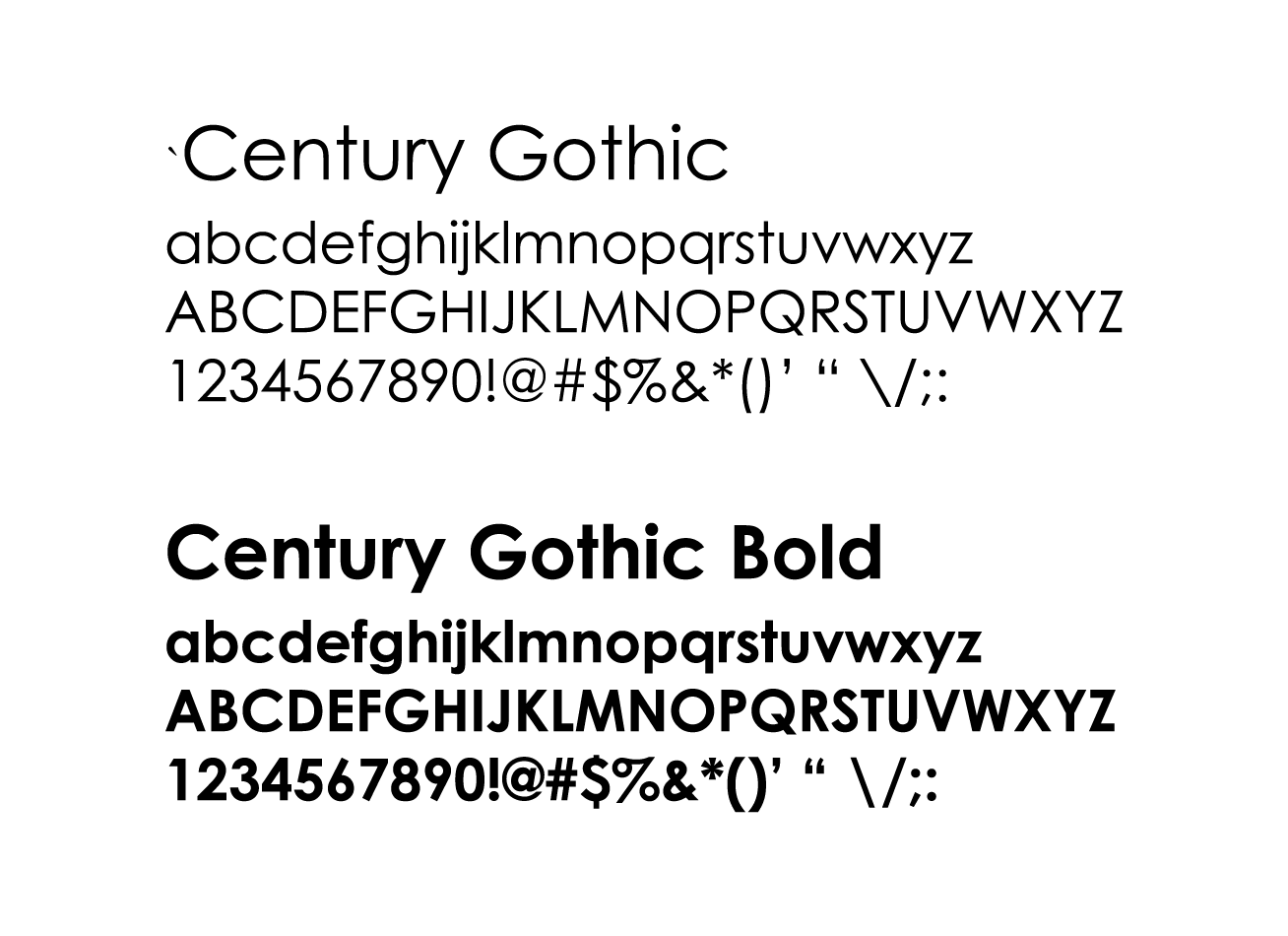
The secondary typeface is Century Gothic.
A modern sans-serif (a font without flares, called serifs, at the end of each letter stroke) picked for its legibility and attractiveness at both heavy and light weights. Century Gothic is ideal for longer passages including email newsletters, internal documents, flyers, and body copy—both on-screen and in print. Use for:
4.0 Social Media
We believe simplicity on social media profiles works best.
For profile images:
Most channels (facebook, twitter, instagram) use square or circular profile images—for those sites the NCCS_Column_Square or NCCS_Column_Inverse work perfectly. Trying to cram your entire logo into those small avatars usually results in an unreadable blur.
For banner or header images:
Some channels (i.e. facebook and twitter) offer banner images above your profile. These have distinct dimensions that we can utilize for unique announcements to parents and the community, for example: announcing summer break, reminders for registration deadlines, and advertising special events.